Note: Below describes only my testing process. Specific findings and design recommendations are hidden due to the confidentiality of this project.
BrickLink
BrickLink was the world’s largest online LEGO® fan community and marketplace. In 2020, we launched the MVP of a new responsive BrickLink website to modernize the platform. Our goal was to focus on new and novice users by simplifying the website to reduce the learning curve. However, if we stripped away even the tiniest feature, the essence of BrickLink was no longer there. This made our existing users very angry.
With our past waterfall workflow, advocating for user research was challenging. Transitioning to agile methodologies, we wanted to focus more on gathering quantitative and qualitative data to make better design decisions.
Overview
Time
2 weeks
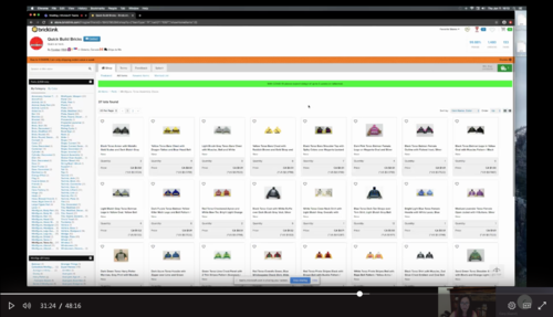
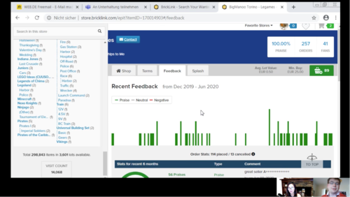
I led remote, one-hour usability testing sessions using Microsoft Teams. Each session began with preliminary questions to gather background information on the user’s buying habits. The user would then walk me through their end-to-end buying experience.
Research Goals
Develop a deep understanding of the different ways our users shop and solve for their unmet needs/friction points across the storefront
Document end-to-end user interactions throughout their browsing flow
Provide a seamless shopping experience with a responsive design that matches the powerful shopping tool currently available on our website
Recruiting Users
I relied on our community admin team to recruit buyers. Our community admin team interacts with our users and stays updated with the threads in our forum. We reached out to a handful of buyers for one-on-one user testing. Since BrickLink is an international marketplace, we have multiple types of users on our site. It was important for us to select both domestic and international buyers, buyers who were solely buyers, and buyers who were both buyer and seller.
I wanted to test a buyer from a country where specific variables may play a large role in selecting a store to shop in. It was important to learn about users in the EU because the EU is our second largest market. Lastly, I wanted to learn about our American buyers, our largest user group.
I conducted interviews with 4 people, for 1 hour each.
Preliminary Questions
Before beginning each user testing, I asked the user for permission to record the session. I reassured the user that it was for internal purposes only as reference during the analyzing phase.
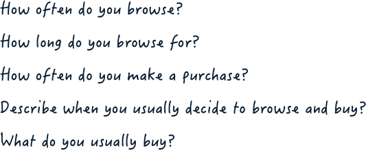
To learn more about their browsing habits, each user was asked these preliminary questions listed below. The findings helped shape user personas based on their buying intentions.
Challenges
Due to technical experience or equipment and device limitations, some users encountered technical difficulties where video or sound would not turn on. Both video and sound were required to properly conduct the user testing.
Overcoming the language barrier and culture differences
Some of our older (longest members who are also a bit older) users are still using BrickLink’s old .asp site which caused very long load times. It also caused broken flows as there are many workarounds with the old .asp site.
Analysis and Outcome
After all interviews were completed, I watched each user testing recordings on Microsoft Streams. I was able to take thorough notes on user satisfaction and pain points that helped mapped user personas, formed user flows, and recommended features to prioritize in the redesign.
Next Steps
My next step was to document my findings to present to the stakeholders before proceeding to the design phase.


