
Company
LEGO BrickLink® is a global marketplace for LEGO products with 15,164 stores globally. On a daily basis, sellers are responsible for managing their stores, which may include an inventory of hundreds of items. BrickLink aims to provide a useful seller tool to help users manage their store inventory. This project addresses the problems users faced when making changes to their inventory.
Overview
My Role
Lead Designer, Research, UX
Team
Stephen (PM), Sydney (Lead Developer), Paulina (UI)
Tools
FIGMA
Problem
Sellers who want to make bulk updates to their inventory items end up using a third party software.
Challenge
Design a feature on BrickLink that allows users to efficiently update their inventory.
Solution
Design an intuitive tool that allows users to search for items and make bulk updates to their inventory directly on BrickLink.
Research
I began my research with a competitive analysis of the third-party software that users were currently using to update their inventory. I then conducted user interviews to learn more about the user journey and experience.
Research Goals
Discover the goals, needs, and frustrations of BrickLink users when managing inventory
Identify the pros and cons of the third party tools users are currently using
Competitive Analysis: Brickstock & Brickstore
I conducted a competitive analysis of the tools that BrickLink users were currently using to update their inventory. I evaluated the strengths and weaknesses of each to see how BrickLink could fill in the gaps moving forward.
Weakness
Learning curve to use software
No longer supported (BrickStock)
Problems extracting up-to-date BrickLink inventory into software
Extra step to get up to date inventory info
No easy way to see when errors occur
Strength
Can view more items at the same time
Filtering items based on user specified requirements
More update options available
Can preview changes before applying to actual BrickLink inventory
User Interviews
In order to learn about a BrickLink seller's user journey when updating their inventory, I recruited participants from our Marketplace Panel, a dedicated group of users that provide constructive feedback on all aspects of the BrickLink experience. I asked users to walk me through their process of updating inventory.
Insights
When users need to make changes to a handful of items, users will make the updates directly on BrickLink.
When users need to make changes to many items, users will use a third-party software.
Pain Points with BrickLink
Too much clutter and not intuitive
There is a lot going on the main My Inventory landing page and it is not easy to use. On this page, users will see:
A list of categories in which their items fall in
Search My Inventory form that can be expanded
Bulk update options at the bottom of the page (see below)

Bulk updates lack options
BrickLink does not provide a way for users to:
Change price by a specific amount
Change price based on the price guide
Round price to a decimal point
Review changes before applying

Not easy to bulk update multiple individual items
To update individual items, users must go to the item level which can be many levels down. The page is cluttered and overwhelming because each item has its own form. Users must input the changes in each item’s form and scroll to the bottom of the page to click on the Submit Changes button. It can be tedious to go through these steps to make the same changes to items that cannot be grouped together.


Bulk updates can only be applied to an entire category
Users are only allowed to make bulk updates to specific types of categorization set by BrickLink, and there is no flexibility for categorization overlap.
Item categorization
Category
Color
Item Type
Year of Release
Condition
Super Lot Type
Availability
Define & Ideate
User story
I worked with the product manager to come up with a user story based on the insights gathered in the research phase. The user story served as a springboard for the ideation phase.
As a BrickLink Store owner…
I want to select and group specific inventory items to update my BrickLink store inventory.
I want to use the price guide to help set my prices.
I want to review changes before applying to avoid unwanted changes.
I want to adjust the price by a certain dollar amount.
I want to adjust the price by a certain percentage.
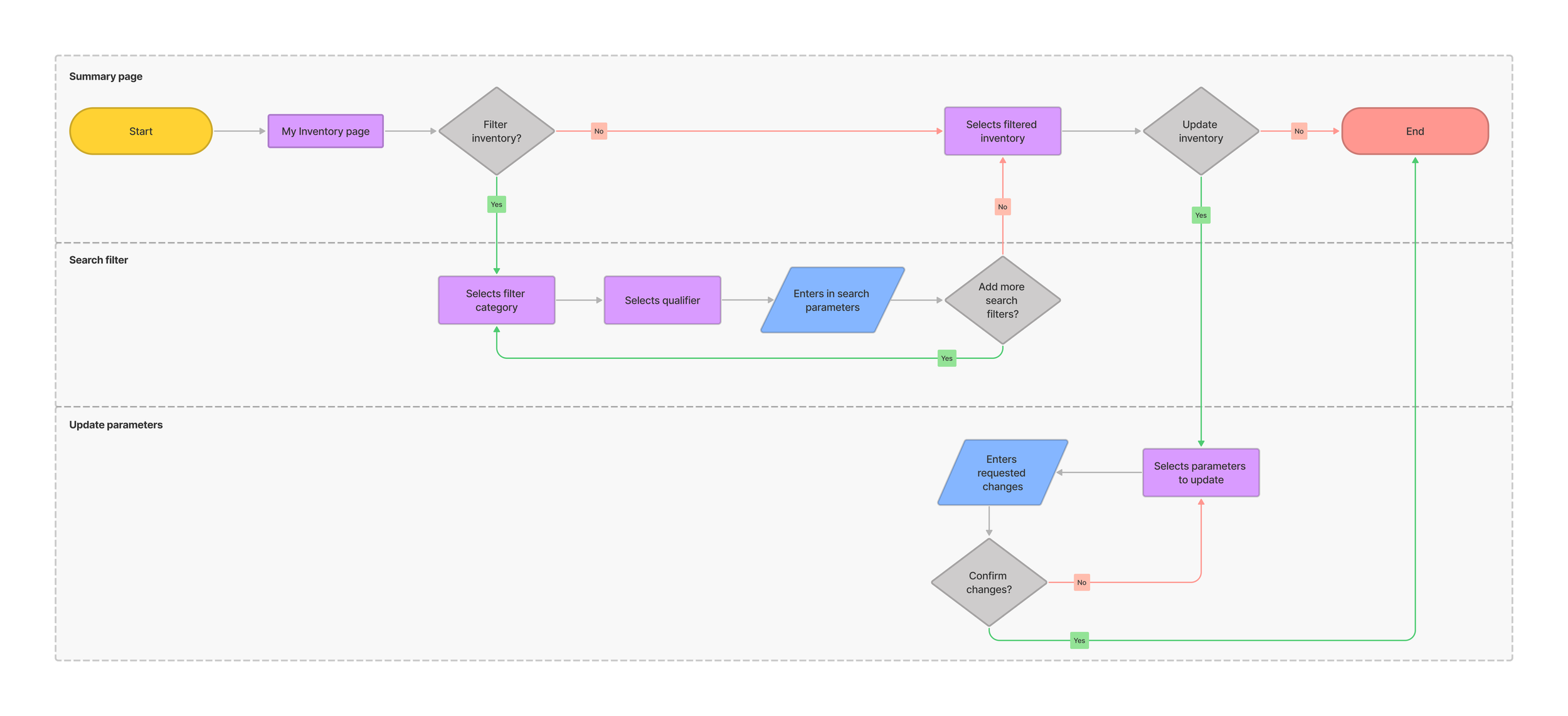
User flow
I created a user flow to identify the key tasks the user needs to take in order to update their inventory. Each task would fall within three key screens
Summary Page
Search Filter
Update parameters
Lofi Sketches
I started out with a few sketches to validate initial ideas. I played around with how to display and filter items while keeping in mind that inventories can contain hundreds of items.


Prototype & Testing
Medium Fidelity Wireframes
After sketching out my ideas, I needed to test the decisions I made to ensure that the structure and flow was intuitive for our users. I created medium fidelity wireframes to help validate the functionality.
I created medium fidelity wireframes of the key screens and created a prototype on Figma. Users would be able to filter inventory items on the search filter page and add items to the summary page where users would be able to apply changes to that set of items.
Search filter
I originally designed the category filters in a sidebar to allow users to easily browse and jump between categories.
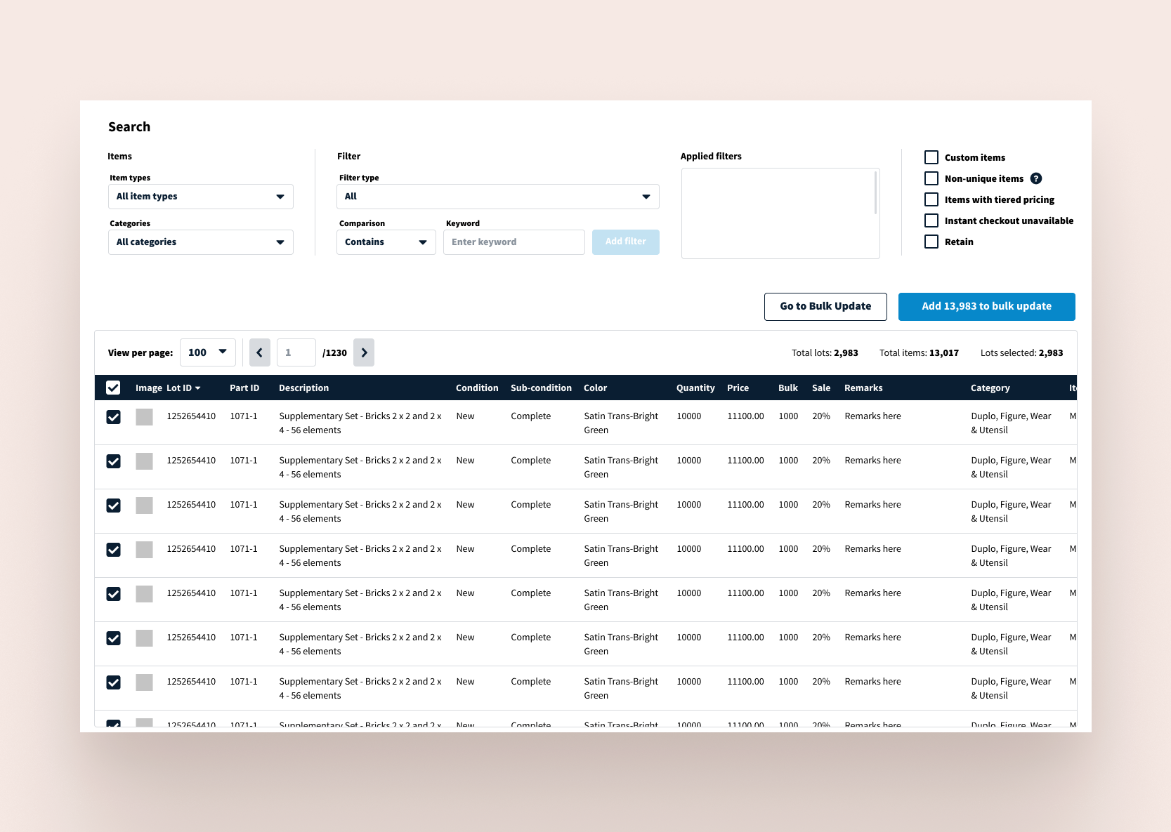
I examined the current search filtering feature and provided the options in a dropdown menu. The filter type dropdown will then inform the following filter fields. For example, the Quantity filter type will show a min and max input field. The Stockroom filter type will show a dropdown menu with all the current selections for stockrooms.
I also designed an option to save filters. Based on user data, users tend to make updates to the same dataset. I wanted to provide the users the option to quickly access their filtered dataset.


Summary page & update parameters
I first laid out all the update options and then categorized them under 6 top level categories: Price, Sale, Tiered Pricing, Availability, Condition, Quantity. Clicking on the top level category will offer options within that category. For example, clicking on Price, users will have the option to adjust the price, set price to price guide, or round price to a decimal. According to user data, there are small items that might be rounded to the third decimal.
The Update form will appear and users can make multiple changes to the dataset. Once users were happy with their changes, users would be able to review changes before publishing the changes to their inventory.
After reviewing the design with the team, I made adjustments to the design based on the developers feedback about what was feasible within our current system.


Usability Testing
I recruited two members from the Marketplace Panel and one internal team member to conduct remote usability testing. I provided a clickable prototype and users were tasked to filter items and make updates to those items. I asked users to walk me through their thoughts and feelings while interacting with the prototype.
Insights
The table listing items was too small, users wanted to see as much info as possible
Users liked the saved filters as it would save them a lot of time
Users were more likely to use the filter form and did not think it was necessary to have the category take up so much screen space
Users liked all the update options and thought it was a huge improvement from the old version
Reiterate
Taking the data gathered from the usability testing, I made revisions to my designs.
Search filter
I removed the category sidebar and stretched the table to fit the width of the browser. Users will be able to see more data columns. I also allowed users to reorder the columns so users can see the most useful information without needing to scroll.
Bulk Update
I added a “refresh” table to reflect the most up to date data to avoid errors. According to developers, this will reduce errors because errors occur when table data does not reflect the actual data (if changes were made on a different page).

Final Prototype
Next Steps
Design Handoff
After finalizing the UX prototype, I will present the final design to the team. Then I will create an annotations document to hand off to the UI designer and developers.